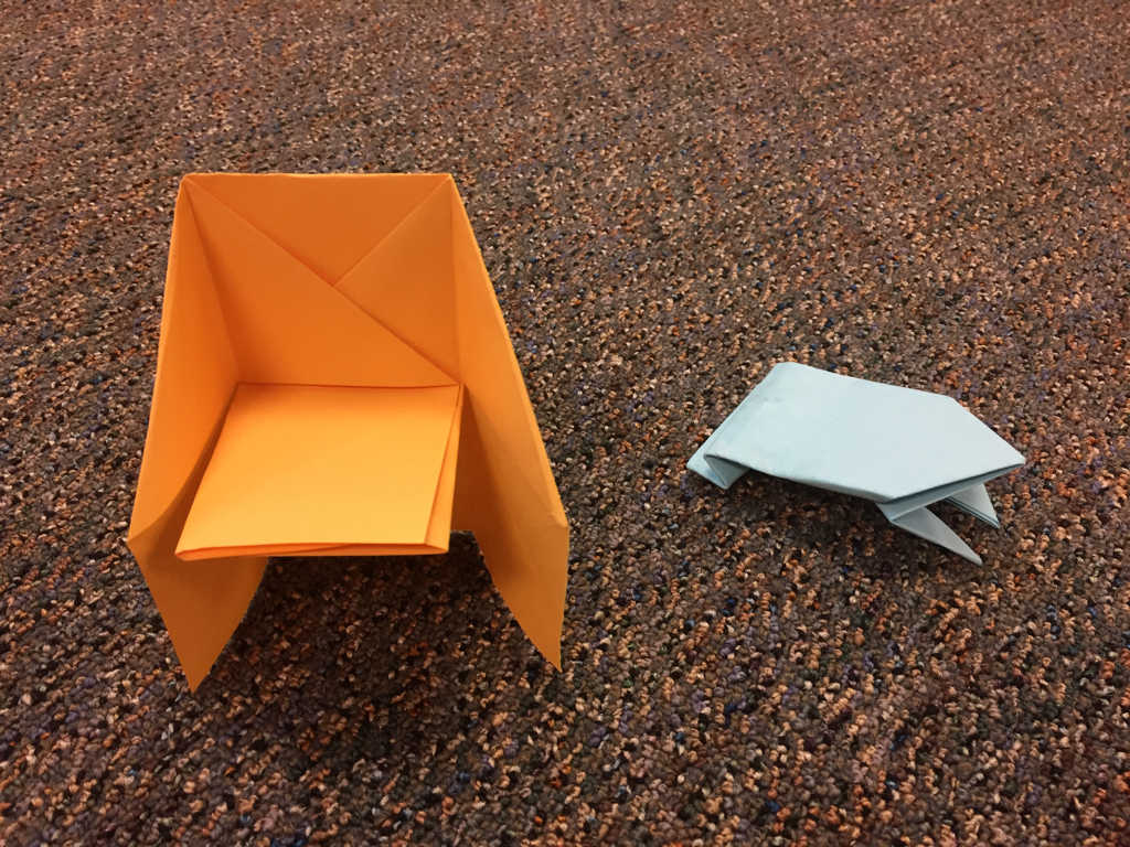
 My group vonsisted of myself, and Cameron. I made a frog and thought Cam how to make one. Cam made a chair, and thought me how to make one
0 Comments
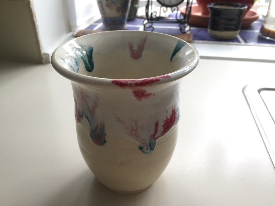 This project is a a tall flower vase. It has a narrow base, which widens towards the center of the project; the walls then move up in a straight line, where they flay out on the top of the project, creating a wide lip. The glaze on this project is very unique compared to my other projects as I chose to use painted on glazes instead of dipping the project entirely in a glaze bucket. The project was first dipped in clear glaze, followed by white glaze which ran to the center of the project. I then painted on strokes of pink, red, and green glaze on the upper half of the project; which created the running colors effect. The distinct movement is shown where the viewers eyes are directed to the strokes of colored glaze, which contrasts the uniform white glaze underneath. The bubbles present in the colored glaze create visible texture that the viewer can see. The biggest skill that I have learned with this project is how to use the painted glazes to create melting effects on my projects. However I still need to learn how to balance the glazes to where I can paint distinct shapes.My favorite thing by far on this project is the colored glazes that seem to melt down my project.
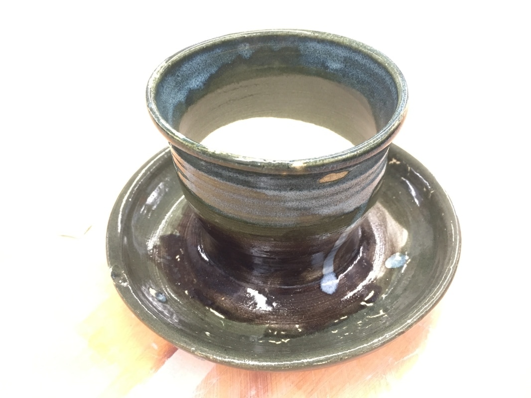 This project is a medium sized planter body, with a large dish along the outside. The body starts narrow along its base, widens when moving up the wall, and flays out at the lip. The dish is very wide with a large path between the two walls. The walls of the dish are thick, with the walls of the body being more thin. The project has a very large crack in the center of it, breaking thought the bottom of the project through the base of the body. The glaze is green along the two walls, with black in between them, and a white glaze on the rim of the body. Although completely unintentional, there is a space shown in the crack that goes through the project. There is also a certain value shown in the lighter blue and darker green glazes on the outside of the project. I think I learned a valuable lesson in this project that I need to make sure not to dry my projects too quickly. If I dry them too fast, the clay will separate and create cracks. My favorite part of the project is most likely the crack however, because of the important lesson in drying that it taught me.
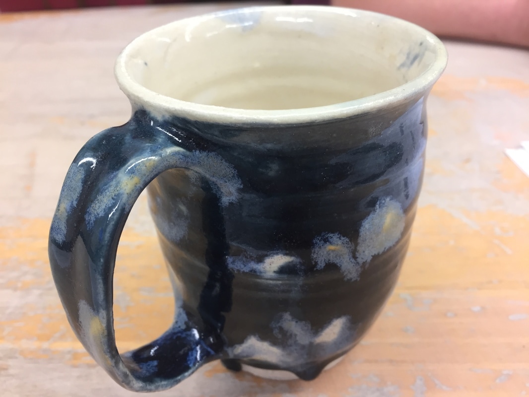 This project is a cup that was thrown on a wheel, with a handle that was pulled from a strip of clay. The base is narrow, and it moves up with straight walls, and a slight lip on the top. The glaze on this project was somewhat of a disaster. The first time in the glaze kiln, I wanted the outside to be blue with the inside white. However it came out splotchy and with many parts on the outside without glaze. I ran it again with white to cover the wholes, however this didn't help much as it was not thick enough. I ran it then a third time. The certain value is shown in the many spots of white contrasting the blue background. This also creates movements in the eye focusing on these contrasting spots. I believe I learned a valuable skill in this project in that I need to create a balance in my projects between using too much clay, and too little. However these white spots from the mistake I made are also probably my favorite parts because of how different they are.
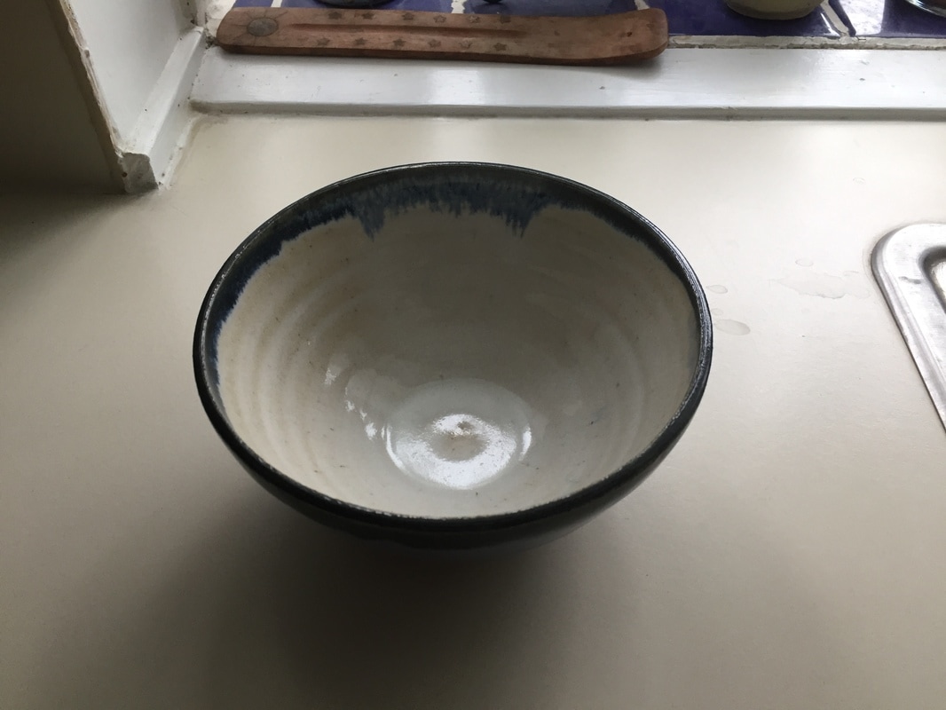
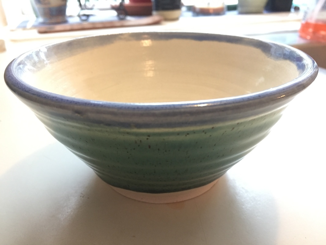 This project is a medium sized bowl. The sides pull up in an inverted cone fashion, and the walls are of about medium thickness. There is also a slight bulge at the lip of the bowl, this was a stylistic choice on my part. I chose the glazes because I wanted to make a more cheery and vibrant project, rather than my other projects, which use darker glazes. The certain unity in this project is shown where the blue and green seem to match together and complement each other on the outside. The white glaze and blue glaze on the inside also show a mild contrast in the light and darker colors. With this project, I believe it show a valuable skill I've learned of pulling up walls higher, and maintaining the center of the project. I was also able to make the bowl into the average size of a normal bowl. Personally, my favorite part about this bowl is the blue and green glazes on the outside of the project, as I believe they go well together.
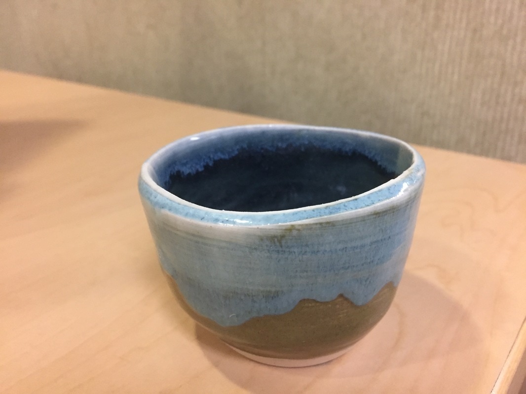 This project is a very small cup or candle holder. The sides are straight with a small footed base. The glaze is light brown throughout the project, with a light blue flowing down from the top. the inside of the project is a darker blue, with light along the rim. The certain value is shown in the contrast of the light and dark blue an the inside of the project. Because of the difference of light brown and light blue, it creates a movement along the meeting of blue and brown. I did not learn any new skills with this project, but rather reinforced my ability to throw effectively and glaze multiple colors well. My favorite part of this project is the two seams between the light blue and dark blue, and the light brown and light blue.
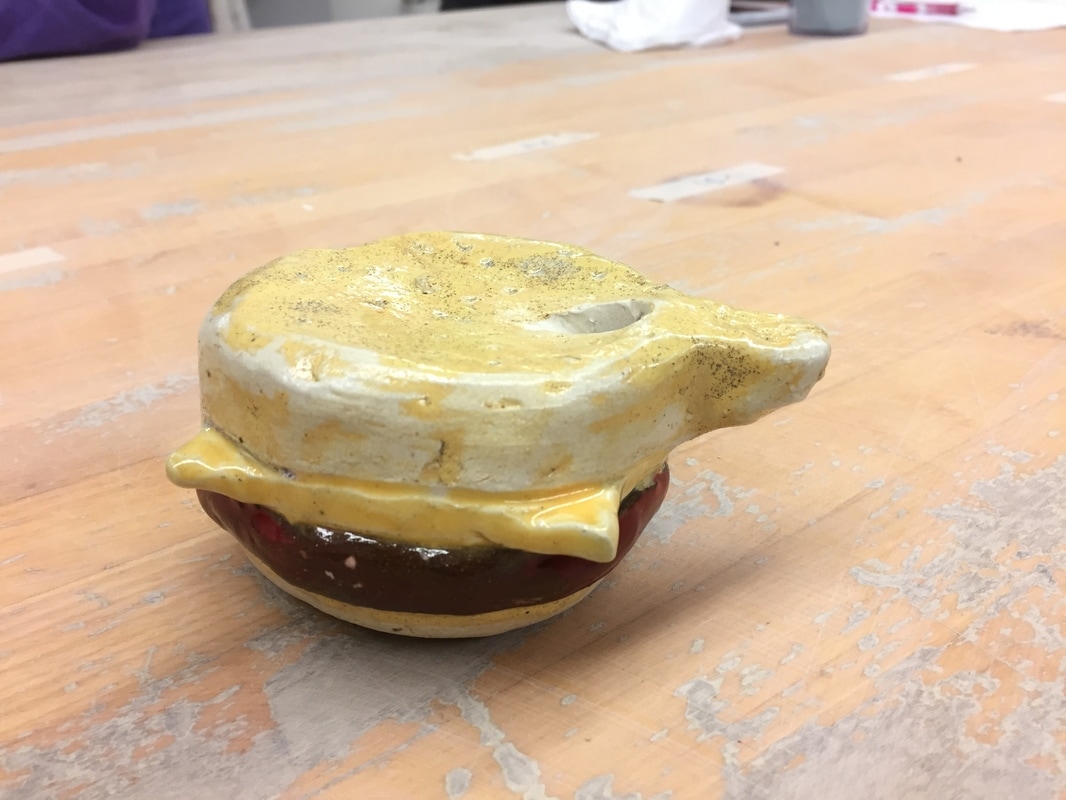 this project is a small whistle made into the shape of a cheeseburger. I used red clay along the middle to give the impression of a the burger meat. I then used small triangular clay pieces to create the look of a square piece of American Cheese. For this project I used the glazes that came in the small bottles. They were used to accent the cheese and burger shapes. The yellow glaze makes the cheese stand out, and the red glaze helps the burger stand out. The balance of shapes and colors makes the pieces come together into the familiar shape of a cheeseburger. This also creates a sense of harmony between the sections. In this project I learned both how to use the small glazes, as well as how to create a whistle using clay. My favorite part of this project would have to be the overall design of it being that of a cheeseburger.
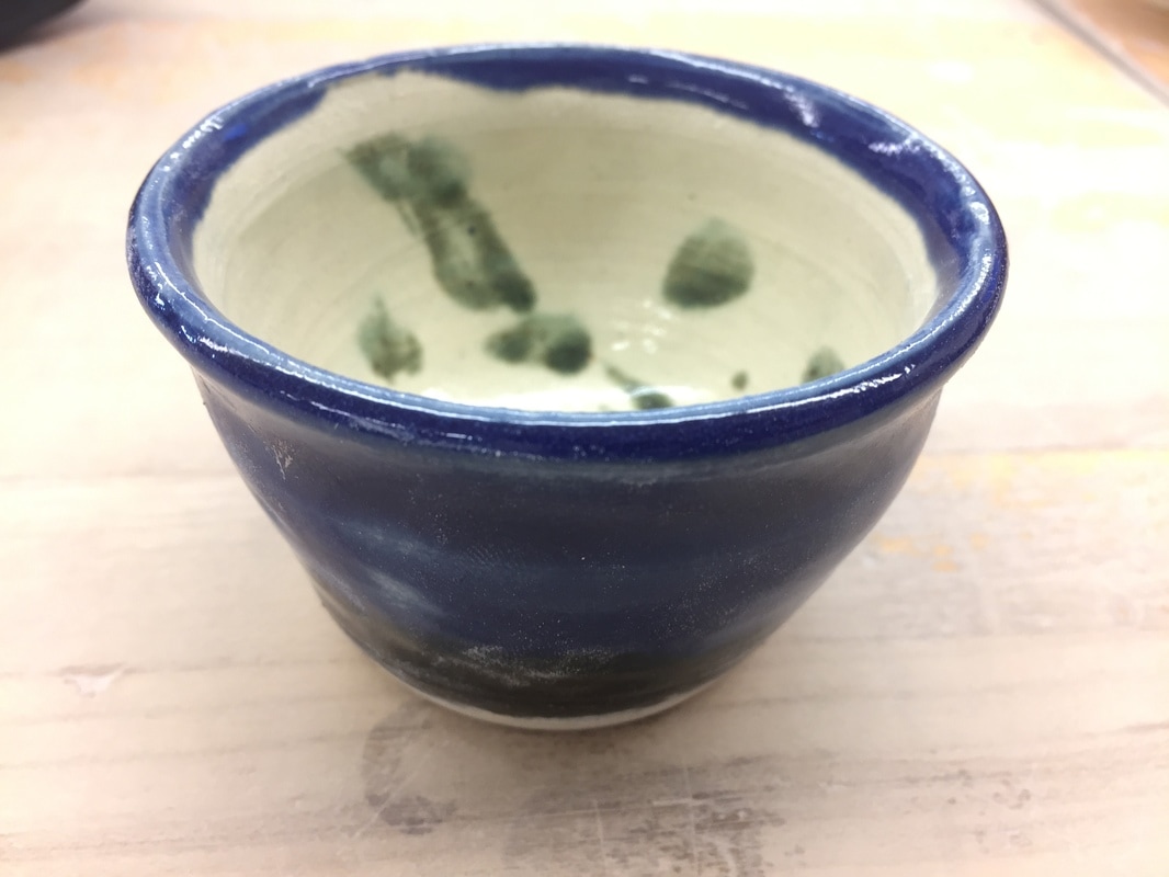 This project is a very small candle holder. It was initially supposed to be a cup, however I underestimated how much sea mix shrinks in the kiln, and so all that this project could really be used for now is to hold a small candle. I used blue glaze on the outside, with some black trim along the bottom. The inside of he project was glazed white with some added in green spots. The certain color is shown along the rim of the project, where the blue and white glazes meet and a distinct separation is formed, defining the inside and outside. There is a certain emphasis shown in these glazes as well; the dark blue and bright white is a main focal point when viewing the project. I did not learn any new skill with this project, however I did reinforce my knowledge of how much projects made out of sea mix shrink. My favorite part of this project has to be how small it is, as it seems very cute and pretty.
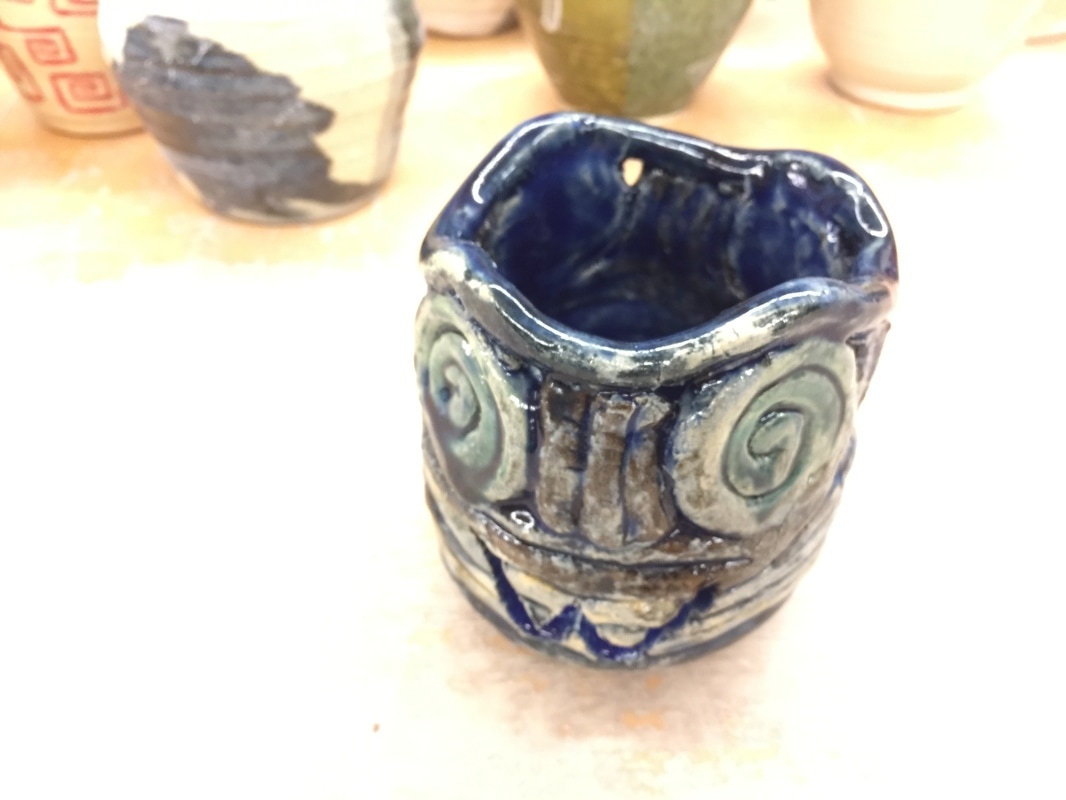 This project is coil pot I made with my group for the social studies teacher, Mr. Wieburg. The project consists of 3 different styles of coils, along with a cut out "W" on the side. The body has long coils along the base, with 4 round coils connected by 4 vertical coil sections, with a single horizontal coil on the top. For this project, I painted glaze on the body first, then dipped the entire thing in blue glaze, before scrubbing away some of the blue. The circular coils give the body shapes of coils, adding to the diversity, and provides movement to them. The project also exhibits balance in its abundance of coil types and variation. A big lesson I learned with this project is that you need to have an undercoat of glaze before you paint on separate glazes, thus the initial glaze can fill the crevices of the project. However this accident I made with it is one of my favorite parts of the project and the first glazes have blended with the blue glaze that was applied after.
|
AuthorWrite something about yourself. No need to be fancy, just an overview. Archives
June 2017
Categories |
 RSS Feed
